Winter is literally coming and we have to be fully ready for the season!
Color is one of the most important details when it comes to decoration, and it has to be well chosen to build the perfect look. So today we are about to give you the Pantone’s winter colors that must be part of your home decor. Keep reading to find out which ones are we talking about.
Rock With Trends: ELECTRIFY YOUR HOME INTERIOR DESIGN WITH PANTONE’S CHERRY TOMATO
While Summer is a more fun and colorful season, winter is more neutral and relaxed when it comes to palettes. Each season the team at the Pantone Color Institute creates the Pantone Fashion Color Trend Report, and there are a few colors that were chosen to be trending during winter. Are you curious to know?
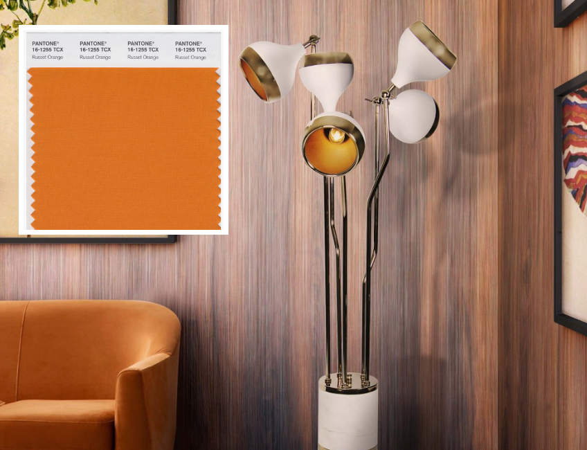
Pantone 16-1255 Russet Orange
![]()
Russet Orange is one of the brightest Pantone colors for the end of 2018, mimicking the fallen leaves. The color will be excellent on all fabrics and even more interesting as a nail lacquer. With just a light touch of imagination, millions of options are available and muted only the slightest bit, your home decor will thank you later.

Pantone 15-3520 Crocus Petal

![]()
Crocus Petal is the lightest yet most romantic of the Pantone 2018 colors on the palette. It is soft and reminiscent of the last vestiges of the spring and summer bouquets, showing the resilience of the last of the lightest purple-toned Ornamental Allium determined to bloom before winter. For us, represents the softest touch of the color of the year- ultraviolet, and it’s easy to style it in your living room design just with the small details.
Pantone 18-5025 Quetzal Green

![]()
Quetzal Green is the truest epitome of bright yet deep. The color will not be confused with any other shade. The color is nothing short of a sensational mix of blues and greens that is sure to be on the runways of the biggest fashion houses.
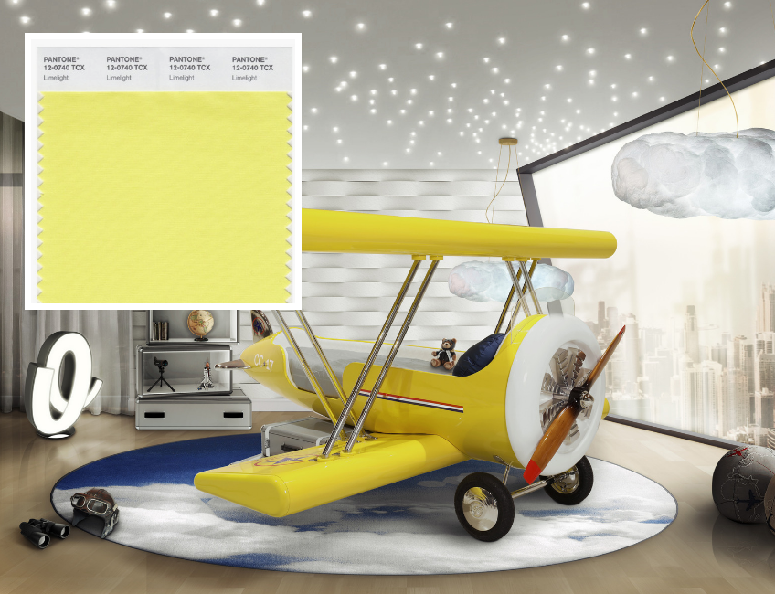
Pantone 12-0740 Limelight
![]()
Limelight is bright and “pungent” as described by Pantone. The shade is the lightest and brightest of the Pantone 2018 colors offered for the fall/winter palette, just a touch brighter than the yellow of the fallen leaves people like to collect during fall.
Pantone 19-1536 Red Pear

![]()
The beautifully, deliciously rich color dubbed Red Pear leads the lineup of the Pantone fall 2018 color trends. The color is just one shade shy of maroon, with such depth in the color that it would work as a base for a pattern, a stunning nail color, and any of the million different options in between.
Pantone 18-4048 Nebulas Blue

![]()
The lighter side of the depth and weight of twilight is Nebulas Blue. It is the fall/winter 2018 color that winks through the tops of the trees in the early evening and is certainly going to inspire jaw-dropping designs. This is the blue that is sure to pop in the fall 2018 patterns and prints as well.
Rock With Trends: FALL TRENDS: WHAT EVERYONE WILL BE OBSESSED WITH, NEXT SEASON
We hope you enjoyed this article about Pantone’s Winter Colors! What do you think? Let us know your thoughts, needs, and wishes and leave a comment. You can find more inspiration and information about interior design, DIY ideas, and event the other articles on home design ideas.